Pure UI
@rauchg|July 13, 2015 (11y ago)705,386 views
I recently redesigned and implemented a new version of VideoPress, the WordPress video platform.
The process involved, among other things, creating a new UI, ditching the dependency on Flash in favor of HTML5 <video> and introducing new functionality.
The particular way in which I implemented it led me to some interesting insights around the growing convergence of the designer and programmer roles.
In the short term, as I’ll show, the communication between the programmer and designer will improve dramatically by becoming well technically delineated.
And if I’m allowed to extrapolate, a clear path is now laid out towards a future where the steps to go from sketch to design to implementation are greatly more accessible to everyone with an idea.
A lot has been written about the merits of React as a library. Today I’m compelled to write about the benefits of a programming model it enables and its implications to the design and creation workflow.
The fundamental idea I want to discuss is the definition of an application’s UI as a pure function of application state.
A pure function is one that exhibits the property of substitution: replacing a call with its returned value should make the program equivalent. As an example, concat('hello', 'world') can be substituted with 'hello world' without changing the behavior of your program.
How can we apply this to a graphical user interface? By having the function return an abstract representation of widgets (or markup) to be rendered on the screen:
function videoplayer({ title, src } = {}){
  if (src) {
    return div(
      div({ 'class': 'title' }, title),
      video({ autoplay: true, loop: true, src })
    );
  } else {
    return div('No video to load');
  }
}
If I call the videoplayer function with no parameters, I’ll consistently get a <div>No video to load</div> back. If I call it with 'Charlie bit mey' and 'charlie.mp4' I'll likewise get the titlebar and video I expect.
Since I’m not returning the actual DOM elements (no document.createElement) or performing any real rendering,
we can think of this function as one that performs mappings between an input (my parameters) and an
output (the virtual dom).
If throughout the lifetime of the program the parameters change (let’s say there’s a new video to play or the user performs an action), the function is called again with new parameters and the rendered view is updated.
With this model in place, the programmer is thus relieved from the burden of specifying the transition between states (or transformation) of the UI over time. No need to specify how to go from A to B: just describe what A looks like and what B looks like, in a discrete way.
UI designers have been intuitively “programming” in this way for some time now, arguably in a more direct way.
While design specifications were usually drawn out on a single canvas, the rise of mobile has forced the industry to think about varying screen sizes (responsiveness).
Artboards have become the de-facto standard [2] to convey how a certain UI is supposed to be rendered for each configuration in graphics software. They allow the creator to shape and position each canvas where elements are placed.
This is what a designer’s handout looks like when using artboards to represent the same content for desktop and for mobile:
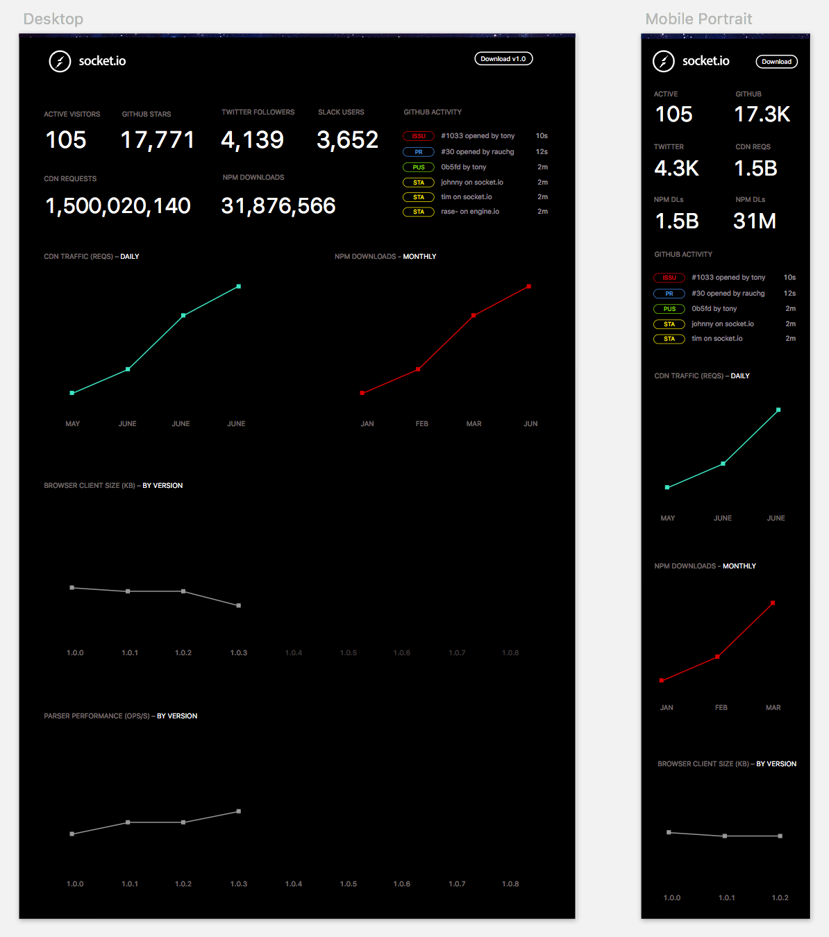
We can think of the example above as the same Socket.IO dashboard() UI function but with different parameters. The
second artboard represents the invocation dashboard({ width: 375 }).
function dashboard({ width, num }){
  // with proper access to the layout data
  // data CSS media queries can be redundant
  if (width > 375) {
    return div('Twitter followers', prettify(num));
  } else {
    return div('Twitter', abbreviate(num));
  }
}
Moreover, seasoned designers have recognized the need for further specification. This can be seen in the popularization of UI styleguides, such as the following example from Github Primer.
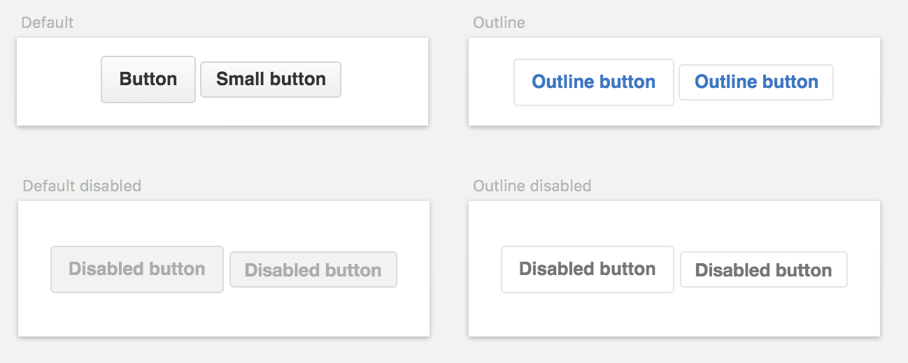
CSS and HTML being fully declarative have lent themselves very well to this task.
We can now think of this as the base function being the <button>, and its parameters being the
class="btn-sm" or disabled. The button produces different outputs depending on the supplied parameters,
which can be combined: <button class="btn-sm btn-outline">, <button disabled class="btn-outline">, and so on.
With this paradigm in mind, I set out to realize the different main states of the video player with my design tool.
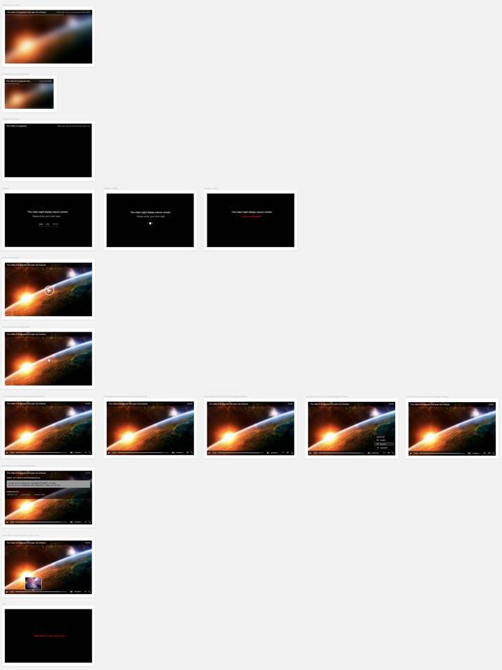
These answer the questions of what the player would look like when
… the video is converting on the backend and not ready for playback yet
… the video has been removed due to DMCA
… a connection or server error occured
… the video is not G rated and the person is asked to enter their age
… the video was playing but no further data was received
… the user hovers the progress bar
The main issue, however, is that underestimating the size of the state space is actually very easy. In other words, it’s difficult to come up with the complete list of questions that your UI needs to answer.
It’s easy because the experience we’re discussing fundamentally revolves around just watching video. Every other state can be seen as exceptional in the same way errors are. Without careful consideration, it could be wrongly reduced to “just <video> and a few extra divs”.
Through this lens, one can hazard an explanation for the age-old problem of poor software development estimates. When the magnitude of the undertaking is not clear for the developer or designer, let alone for the people removed from the creation process, it’s simply impossible to make any accurate predictions.
Unlike other projects I’d worked on in the past, the next step of the implementation almost perfectly matched the design workflow. I broke down the initial design into even smaller functions that would be rendered into HTML artboards.
Since these functions are essentially acting as mappings between data and UI, I created a simple JSON file that would describe the different parameters for each state.
{
  "title": "Thumb tooltip",
  "views": [
    [
      {
        "title": "Default",
        "require": "../views/thumb-tip",
        "params": {
          "width": 136,
          "height": 78,
          "css": true
        }
      },
      {
        "title": "Custom offset (30px)",
        "require": "../views/thumb-tip",
        "params": {
          "width": 136,
          "height": 78,
          "tipLeft": 30
        }
      },
      {
        "title": "Custom offset (left edge)",
        "require": "../views/thumb-tip",
        "params": {
          "width": 136,
          "height": 78,
          "tipLeft": 0
        }
      },
      // …
    ]
  ]
}
Throughout this exercise it became apparent that there was more to the project than what I had contemplated in my original plan.
As an example, it wasn’t enough just to consider a state where there’s a tooltip on top of the progress bar. But also what happens if the tip is positioned to the leftmost or rightmost edge of the toolbar. Or if it’s triggered without the image having loaded yet.
In many cases, it’s necessary to go back to the design tool and represent these new states adequately. For the tips, I had to split the triangle in half if they approach the boundaries of the player. I added a state to display when the image grid is not loaded yet. And so on. The tooltip alone expanded into the 6 representations seen above.
This allows us to make a distinction of two very distinct (yet frequently interleaved) phases of the creation process: design and discovery.
Design is the process of taking the available data and coming up with its representation. The outcome is reasonably well specified and understood.
Discovery is about the transformation (usually expansion) of that input. It’s the evolution of the design. The uncovering of new states and new ideas throughout the process itself.
Even the most careful designer that can anticipate -due to their extensive experience and ability- a wide range of scenarios will necessarily participate in this feedback loop.
First, there’s a potentially infinite number of permutations of the parameters they’re trying to design. Only some of the combinations can (and should) be considered at the design stage.
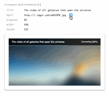
An example from this project is the conversion phase of the video. While the video is converting, I intended to show a blurred out thumbnail with a progress bar that notifies the user in realtime.
Once rendered, I incorporated a [+] icon (which you can click above) to modify the parameters with which the view was invoked and rendered.
One can then experiment and modify the parameters (or potentially introduce some chaos) and get direct feedback.
In this case, clicking and dragging the numbers to alter the dimensions of the player allows us to see how it would perform in the real world beyond just the breakpoints specified by the designer, like iPhone or iPad size.
When a parameter is recognized as an image, an extra link is added to retrieve a random image from imgur. It turns out that light images were actually not very friendly to the particular design I picked for the progress bar, and it had to be revisited. Adding some shadows made it perform well with a wide range of photos:
Another way in which discovery occurs, usually more painstakingly, is in the implementation process itself.
In the case of video streaming, something that can be easily overlooked (which falls under the category of “errors”) is that the download of the video can stall completely. When this happens, the MediaElement API emits a stalled event.
Both designer and developer can be oblivious to details like that initially. But under this model, the communication between the designer and developer now consists of a very clear protocol.
The next step is for the design mockup to be created for the player but with the extra parameter <code>{'{ stalled: true }'}</code>. And so the TODO list expands, but in a way that neatly breaks down responsibilities.
This workflow brings us closer to understanding the completeness of implementation in a very direct way. If you think up and hand out 20 distinct states in which your application can behave, then you should be able to clearly see them rendered on a screen as HTML. If only 10 are done, then the implementation is only 50% done.
To contrast this, consider a simple payment form with jQuery. The server responds 200 if the payment succeeds, or 400 otherwise. The programmer that’s in charge of implementing this writes:
function pay(){
  $.ajax({ url: ‘/api/pay’ })
    .fail(() => $(‘#msg-error’).show())
    .success(() => {
      $('#payment').hide();
      $('#msg-success').show();
    });
}
What if we now wanted to see the two states this procedure can yield, to assess our progress?
The only way one could confidently determine the correctness and completeness of the implementation would be actually executing the code. In a simple case like this, the task would be to ensure that both logical branches (failure and success) are executed.
This, in practice, can actually be quite convoluted. Applications must handle different states that are difficult to replicate under normal testing conditions. They must provide answers to questions like “what if this network call is taking too long?”, “what if it the response doesn’t come back?” and “what if the server returns an error?”, among others.
In addition, getting to the particular payment form in this example could be the result of more branching. You must first be logged in, maybe under a certain type of user, of a certain role and specific privileges, with some pre-existing data in their profile.
The ideas outlined in this article can hopefully lead to the implementation of a workflow that maximizes productivity, efficiency, correctness and completeness.
Mapping out your application in this way can not only allow you to measure progress but also complexity. Are there too many steps? Too many screens? Are they consistent?
Visualizing the evolution of this map over time can shed light into how accurate the initial preconceptions of the task at hand were. If much of the map is discovered later on, it could mean that the project was improperly scoped or understood, and it can explain why it’s taking longer to ship.
The design and creation of an application serves a clear goal: the creative representation of some data a set of users are interested in.
The techniques described allow for this process to be significantly smoother, by ensuring that designer and programmer share a common guide. That being said, there’s still a very clear repetition of effort when translating these creative ideas from our minds to the medium.
As we continue to refine our understanding of the entire process, our tools will follow.
Lorem Ipsum has had a good run. Let’s replace it with data.
1. ^ In general, comparing libraries or frameworks in terms of features seems inferior to examining the model it imposes on the programmer. The latter will inform you about how well the code will fare over time as the product matures and the team grows, but the former won’t. It will also empower you to foresee what the evolutionary path of the technology looks like.
2. ^ Artboards were initially introduced by Illustrator as a way of grouping related designs together, such as a company's business stationary. Sketch popularized its usage to represent designs targing varying devices and screen sizes, and Photoshop is now incorporating the feature.